Exploring a dataset consisting of one nominal variable, it is a good start to look at the graphical distribution of the data. One possible procedure in order to represent the distribution is to produce a pie chart.
A pie chart is a chart in the shape of a disk that is divided into sectors which represent the proportions. Even though the pie chart is widely used, it has been criticized for being difficult to interpret (Gries 2009a: 190). Many observers find it difficult to compare differently sized sections of a pie chart. Still, pie charts can be useful in some cases, particularly if the intention is to compare the size of a slice with the whole pie.
For generating a pie chart, use the function pie. The first argument is the vector to be represented as a pie chart:
> pie(vector)
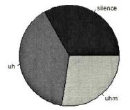
Fig. 2: A pie chart with the frequencies of disfluencies (Gries 2009b: 102).
For using one’s own category names, the argument labels=... can be used, for different colors you can use col=... etc., for example (Gries 2009b: 102):
> pie(Filler), col=c("grey20", "grey50", "grey80"))
This line will produce the image in Fig. 2. The vector Filler here represents one out of five variables of a given data frame about disfluencies (cf. Gries 2009b: 97). The vector contains the three levels silence, uh and uhm, as can be seen in Fig. 2.
If you would like to avoid using a pie chart, another, probably better way to represent the data would be a bar chart.
A bar chart (also called bar graph or bar plot) is a chart with vertically or horizontally plotted, rectangular columns, whose lengths are in proportion to the values of the nominal variable that they represent.
In order to create a bar plot, use the function barplot. In case you would like to insert your own category names, this time use names.arg=... instead of labels=... (Gries 2009b: 102f). For instance (Gries 2009a: 190):
> barplot(vector), col=c("grey20", "grey40", "grey60"), names.arg=c("Silence, "Uh, "Uhm"))
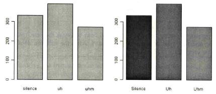
Fig. 3: Bar plots with the frequencies of disfluencies (Gries 2009b: 103).
In order to facilitate adding further data, Gries (2009b: 102f.) recommends entering space=0 so that the bars stand immediately side by side.
As an example, he describes how with the function text it is then easy to plot the observed frequencies into the middle of each bar: the first argument of the function text is a vector with the x-axis coordinates of the entered text (since the text is supposed to be in the middle of each bar, the coordinates will be 0.5, 1.5, 2.5, etc.). The second argument is a vector with the y-axis coordinates of the text, which Gries recommends to be half of each observed frequency). Finally, labels=... is where the future text has to be inserted (Gries 2009b: 102f.):
> barplot(vector), col=c("grey40", "grey60", "grey80"), names.arg=c("Silence, "Uh, "Uhm"), space=0)
> text(c(0.5, 1.5, 2.5), vector/2, labels=vector)
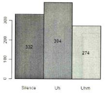
Fig. 4: Bar plot with the frequencies of disfluencies (Gries 2009b: 103).
One should be aware that the bar chart is often confused with the histogram. In comparison to the bar chart, which is meant to represent nominal or ordinal data, a histogram can only be used with classified metric data (such as interval and ratio data). Therefore, I personally think it is questionable to remove the gaps between the columns of a bar chart, since this makes beginners more susceptible to confusion.
Another way to visualize nominal data frequencies is a Pareto chart. A Pareto chart contains both bars and a line graph. The individual values of the observed categories can be inferred from the bars (left vertical axis), which are organized in descending order of their values, whereas the line represents the cumulative percentages (right vertical axis). The Pareto chart is particularly suitable for indicating the most important values of a variable. For using the function pareto.chart, first you have to install and load the library qcc (Gries 2009b: 104).
> library(qcc)
> pareto.chart(vector)
Pareto chart analysis for table(vector)
Frequency Cum.Freq. Percentage Cum. Percent.
uh 394 394 39.4 39.4
silence 332 726 33.2 72.6
uhm 274 1000 27. 4 100.0
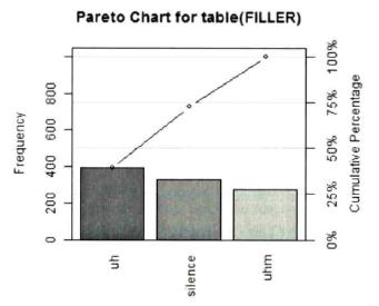
Fig. 5: Pareto-chart with the frequencies of disfluencies (Gries 2009b: 104).
The easiest way to visually represent a single metric variable is by employing the function plot. This is a very useful, multipurpose function, able to create a variety of graphs depending on the arguments used. In the current case, with one metric vector as an argument, the result is a scatterplot in which the y-axis shows the values of the vector, and the x-axis shows the order in which they appear, for instance (Gries 2009b: 98):
> a<-c(1, 3, 5, 2, 4)
> plot(a)
Here only the data of the vector a is used (compare the left panel of Fig. 6). In comparison, when two vectors a and b are given as arguments, the values of the first vector are interpreted as coordinates of the x-axis and the values of the second vector as coordinates of the y-axis (compare the right panel of Fig. 6):
> b<-1:5
> plot(a, b)
R provides several commands for generating frequently used sequences of numbers. The notation 1:5 for vector b for instance represents the vector b(1, 2, 3, 4, 5).
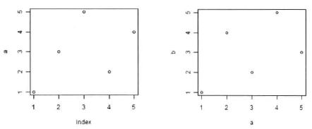
Fig. 6: Simple scatterplots (Gries 2009b: 98).
Compared to a scatterplot, in which each data point of a vector is plotted individually, for a histogram, vectors and factors have to be summarized in groups of elements.
Just as a bar chart, a histogram consists of columns. The difference between a histogram and a bar chart is that whereas a bar chart represents nominal variables, the columns of a histogram are used to show the frequencies of values defined by interval/ratio variables. The fact that the columns usually do not have any space between each other emphasizes that this kind of graph is concerned with continuous data (Gries 2009b: 105f.). (Discrete data are not mentioned in much detail in any of the books used, which is why they do not have a chapter on this companion website.)
For a histogram, you can use the function hist, with the vector you want to visualize as its argument:
> hist(vector)
If you want your data to be distributed into a certain number of bars (also called bins), use the argument breaks=... You can either enter an integer that is the number of groups you would like to have, or you can provide a vector with the column boundaries. In case you choose the latter option, you will not have any influence on the number of bins chosen. GRIES gives a formula that will tell you how many bins you should choose for your data (Gries 2009b: 105f.):
Number of bins for a histogram of n data points = 1+3.32·log10n
The most important aspect though is that the number of bins chosen does not distort the actual distribution, since the shape of a histogram largely depends on the selected column width (Johnson 2008: 10).
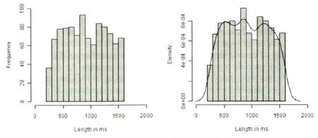
Fig. 7: Histograms for the frequencies of lengths of disfluencies (Gries 2009b: 105).
Still, histograms may remain somewhat unsatisfactory due to the discrete jumps from one bar to the next, since the real distribution of continuous data is thought to be smooth. More appropriate is a ‘smoothed histogram’ with help of the function density. Based on the function hist, it is easy to add such a curve (Gries 2009b: 105f., compare right panel of Fig. 7):
> hist(vector, main="", xlab="Length in ms", ylab="Density", freq=F, xlim=c(0, 2000), col="grey50")
> lines(density(vector)
Another way of creating a histogram is using the function truehist (Baayen 23). This function is available in the MASS package, which can be made accessible with:
> library(MASS)
It is also possible to add a smoothed line to a histogram designed with truehist. This process is a little bit more complex, and unfortunately goes beyond the limits of this companion website. It is described in Baayen (2008: 25ff.) and I encourage you to familiarize yourself with this or one of the other books recommended on this website in order to broaden your R skills. For being able to combine a histogram with a theoretical normal distribution curve, I recommend reading Johnson (2008: 12).
Created with the Personal Edition of HelpNDoc: Easy EPub and documentation editor